
SEO-Friendly Web Design: 7 Key Elements Every Website Needs
The Impact of Mobile-First Design on User Experience and SEO
With more than half of all global web traffic coming from mobile devices, businesses are being forced to rethink how they design their websites. A mobile-first approach is no longer optional — it’s the new standard for both user satisfaction and search engine optimization (SEO).
Mobile-first design refers to building a website starting with the mobile layout first and then scaling up to desktop. This strategy ensures the most essential content and functionalities are prioritized for small-screen users.
Why Mobile-First Design Became Essential
The rise in smartphone use has redefined how people browse, shop, and interact online. According to Statista, over 60% of all web visits now originate from mobile devices. Users expect seamless experiences — fast loading, touch-friendly interfaces, and concise content.
If a mobile site is slow or difficult to navigate, users abandon it quickly. Google recognizes this behavior and factors mobile experience into its ranking algorithm.
How Mobile-First Enhances User Experience (UX)
Designing with a mobile-first mindset improves user satisfaction. Pages load faster, content feels clearer, and navigation becomes more intuitive.
One core benefit is performance optimization. Mobile-first sites are often less bloated, meaning they load faster even on slower networks. Lightweight CSS, compressed images, and minimal JavaScript become standard practices.
Another benefit is interface clarity. Designers must think critically about what information is truly essential. Features like hamburger menus, sticky CTAs (calls-to-action), and large tap targets become central design tools.
Most importantly, a mobile-first layout ensures that users can complete actions — like filling out forms or making purchases — without frustration, increasing conversions.
The SEO Benefits of Mobile-First Design
Since Google officially switched to mobile-first indexing in 2019, it now uses the mobile version of your site for crawling and ranking. That means your mobile layout isn’t just a bonus — it’s your website’s primary face to search engines.
Websites built with mobile-first principles often score better on Core Web Vitals, which include metrics like Largest Contentful Paint (LCP), First Input Delay (FID), and Cumulative Layout Shift (CLS). These vitals heavily impact SEO.
Additionally, responsive design reduces bounce rates and encourages longer session durations, signaling to Google that your site offers value.
Responsive Web Design Complements Mobile-First
While mobile-first is the design strategy, responsive design is the technical implementation. It ensures your layout adapts fluidly to any screen size.
This device-agnostic approach uses flexible grids, scalable images, and media queries to deliver a consistent experience. The major advantage is codebase simplicity — you manage one website, one set of content, with less overhead.
Avoid These Common Mistakes in Mobile-First Design
Despite best intentions, some websites fall into traps:
- Overloading mobile layouts: Trying to shrink the entire desktop experience leads to clutter. Instead, embrace minimalism.
- Ignoring mobile navigation patterns: A complex menu on desktop may need a collapsible version on mobile.
- Neglecting performance: Unoptimized images, third-party scripts, or bloated libraries can slow load time.
Test thoroughly on real devices. Tools like Google’s Mobile-Friendly Test or PageSpeed Insights are helpful, but nothing replaces human feedback.
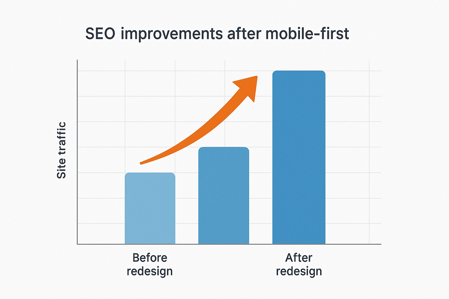
Case Study: Real Business Benefits from Going Mobile-First
An online clothing retailer experienced significant improvements after redesigning with a mobile-first approach:
- Bounce rate dropped from 65% to 40%
- Mobile conversion rate increased by 50%
- Page load time improved by 38%
- Organic traffic saw a 32% lift over 3 months
These gains stemmed from prioritizing speed, mobile UX, and SEO structure — all from starting with the mobile view.
What the Future Holds for Mobile-First Design
Looking ahead, we can expect even deeper integration between mobile-first and emerging tech trends:
- Voice search optimization: With more mobile users using voice assistants, content needs to be structured for conversational queries.
- Progressive Web Apps (PWAs): These enhance mobile capabilities with features like offline mode, home screen shortcuts, and push notifications.
- AI personalization: Mobile-first experiences will likely include more intelligent content delivery based on user location, preferences, and behavior.
Final Thoughts

Mobile-first design is more than a trend — it’s a necessity. It not only satisfies the majority of your users but also positions your website for better performance, higher rankings, and stronger engagement.
By embracing mobile-first principles and combining them with responsive design and SEO best practices, your website becomes future-ready, user-friendly, and algorithm-approved.
 +6011 1085 3539