
Case Study: How a Redesign Increased Website Traffic by 300%
Case Study: How a Redesign Increased Website Traffic by 300%
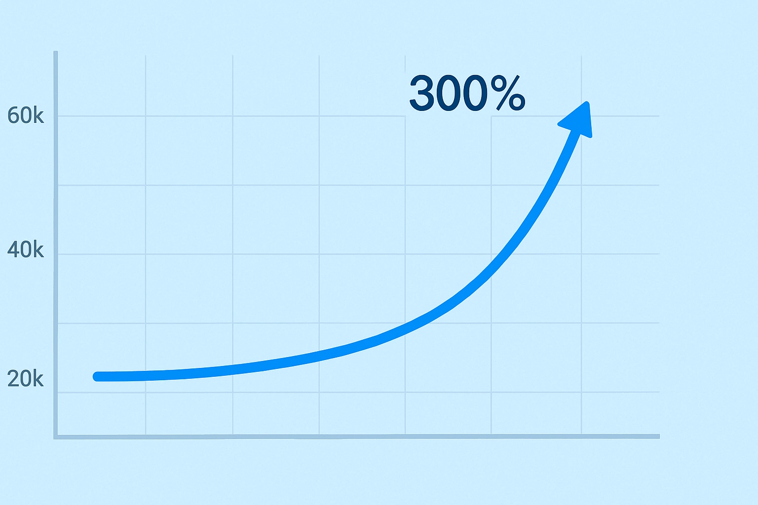
In today’s digital age, a website is often the first impression customers have of your business. But what happens when that impression is outdated, slow, or confusing? For one growing B2B tech company, the solution was a bold website redesign — one that resulted in a 300% increase in traffic in just four months.
This case study breaks down how they achieved such results, what strategies worked, and how you can apply the same principles to your own website.
The Problem: Stagnant Growth and High Bounce Rate
Before the redesign, the company’s website hadn’t been updated in nearly five years. Despite having valuable content and a strong offering, the traffic plateaued, bounce rates were climbing, and conversions were lagging.
Key issues identified:
- Outdated, non-responsive design
- Slow load times
- Poor SEO structure (missing H1s, duplicate content)
- Confusing navigation and unclear CTAs
- No mobile optimization
Analytics revealed:
- Average bounce rate: 72%
- Average session duration: under 40 seconds
- Organic traffic: declining month over month
The team knew that cosmetic changes weren’t enough — they needed a full strategic and technical overhaul.
--------
Step 1: Redefining Goals and Metrics
Instead of diving into aesthetics first, the redesign project began with a business and marketing audit.
Main goals:
Increase organic traffic by 150% in six months
Lower bounce rate below 50%
Improve engagement (time on site and page depth)
Generate 2x more qualified leads
These goals shaped every decision — from copy and structure to speed and mobile responsiveness.
--------
Step 2: SEO and Structure First
Before enhancing the user interface, the team—backed by a professional SEO company—began by conducting a comprehensive technical SEO audit and strategically restructuring the site hierarchy for optimal search performance.
Tactical Improvements:
Established a clear H1–H3 heading hierarchy on each page to improve content readability and crawlability.
Minimized duplicate content by applying canonical tags, ensuring consistency and stronger page authority.
Optimized all images with descriptive alt text and compression techniques, a vital step in technical SEO.
Implemented breadcrumb navigation to enhance both user experience and crawl paths for search engines.
Enabled lazy loading and media compression to significantly boost site speed and performance.
Additionally, the team overhauled the blog template, integrating schema markup, keyword-rich category pages, and enhanced internal linking strategies—hallmarks of an effective SEO company’s approach to scalable content optimization.
--------
Step 3: User Experience & Mobile-First Redesign
As a professional web design company, our focus for this phase was to elevate speed, clarity, and usability—especially for mobile users.
Adopting a mobile-first design approach, the redesign emphasized:
Touch-friendly navigation enhanced by a sticky header
Clean, single-column content layout for improved readability on handheld devices
Accordion-style FAQs and CTA buttons strategically placed within thumb-friendly zones
Font sizes optimized specifically for small screens to ensure effortless reading
To support a cutting-edge user experience, the team transitioned to a modern tech stack powered by Next.js—enabling fast server-side rendering and significantly improved performance scores on tools like Google Lighthouse.
This mobile-first transformation reflects the level of thoughtfulness and technical precision expected from a professional web design company committed to delivering high-performing, user-focused digital experiences.
--------
Step 4: Visual Branding and Content Refresh
Beyond performance, the redesign also elevated the brand. Outdated visuals were replaced with bold typography, authentic photos, and cleaner white space.
Content upgrades:
- Rewritten service pages with clear value propositions
- Shorter paragraphs, clear headlines, and stronger CTAs
- New “Resources” section with guides, webinars, and whitepapers
- Social proof added through logos, reviews, and testimonials
This made the site not just faster, but more trustworthy and professional.
Traffic Growth Results
Within just four months of launch, analytics showed remarkable improvements:
| Metric | Before | After 4 Months |
|---|---|---|
| Monthly Website Traffic | 12,000 | 48,000 (+300%) |
| Average Bounce Rate | 72% | 43% |
| Average Session Duration | 38 sec | 2 min 20 sec |
| Pages per Session | 1.4 | 3.1 |
| Conversion Rate | 1.1% | 3.9% |
Rather than guessing, every choice was based on real data — heatmaps, analytics, feedback sessions, and benchmark testing.
Lessons You Can Apply
Even if your redesign budget isn’t large, you can still apply the same core principles:
- Start with goals, not graphics
- Audit your SEO thoroughly before design
- Prioritize mobile and page speed
- Refresh your content, not just your layout
- Test continuously after launch
Redesign isn’t just a facelift — it’s a transformation of how users experience your brand.
Conclusion: Wesite Redesign for Results
In 2025, your website is more than a digital business card — it’s your sales engine, marketing hub, and trust-builder. A well-executed redesign can lead to exponential growth, just like it did in this case study.
Whether you’re suffering from high bounce rates or flatlining traffic, now’s the time to invest in design that performs.
Don’t redesign for aesthetics. Redesign for outcomes — and watch your numbers rise.
